
Why a Mobile SEO Service Is No Longer Optional in 2026
Investing in a mobile SEO service is now one of the most direct ways a local business can win more customers online. Here’s a quick summary of what it means and why it matters:
What is a Mobile SEO Service?
| Element | What It Means for Your Business |
|---|---|
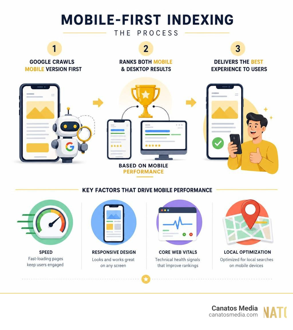
| Mobile-first optimization | Google ranks your site based on how it performs on phones, not desktops |
| Page speed | Pages that load in under 2 seconds keep visitors; slower pages lose 53% of them instantly |
| Responsive design | Your site adapts to any screen size automatically |
| Voice & local search | Optimized for the 90% of local searches that happen on mobile devices |
| Core Web Vitals | Technical health scores Google uses to rank your pages |
In short: if your website isn’t built for mobile users, Google won’t show it — and potential customers won’t find you.
Mobile devices now account for 64.35% of all global web traffic. That number has climbed every single year, and 2026 is no different. Yet most local business websites are still built and managed as if their visitors are sitting at a desktop computer. They’re not.
When someone needs a plumber, a restaurant, or a marketing agency right now, they pull out their phone. If your site loads slowly, looks broken on a small screen, or buries your contact details — they’re gone in seconds. A competitor who did optimize for mobile gets the call instead.
The stakes are real. Businesses optimized for mobile see up to 2.3× higher conversion rates. And with search engines being 400% more effective at driving sales than social media, ignoring mobile SEO means leaving a significant amount of revenue on the table.
I’m Nic Canobbio, founder of Canatos Media — with over two decades in media production, content strategy, and digital growth, I’ve seen how a well-executed mobile SEO service transforms a business’s online visibility and lead flow. In this guide, I’ll walk you through exactly what it takes to win on mobile in 2026.
Discover more about mobile seo service:
What is Mobile SEO and Why It Dominates in 2026
Mobile SEO is the practice of optimizing your website to ensure it looks, feels, and performs beautifully on smartphones and tablets. In 2026, mobile SEO is no longer a secondary branch of search engine optimization; it is the trunk of the tree.
Google’s search algorithms prioritize the mobile version of your website for both indexation and ranking. If your mobile site is slow, clunky, or missing key information, your desktop rankings will suffer too. At Canatos Media, we look at mobile optimization as the absolute foundation of any digital growth strategy. If you want to dive deeper into the mechanics of search, you can learn more about SEO and how it drives long-term visibility.
For businesses in the New York tri-state area and Long Island, this shift is particularly critical. Local consumers are constantly on the move, searching for immediate solutions. If your mobile experience isn’t seamless, you are essentially handing leads directly to your competitors.
How Mobile SEO Differs From Traditional Desktop SEO
Many business owners assume that if their website looks good on a desktop monitor, it will perform just fine on a phone. This is a costly misconception. Mobile SEO differs from traditional desktop SEO in several fundamental ways, including screen real estate, user intent, and technical execution.
| Feature / Metric | Traditional Desktop SEO | Mobile SEO |
|---|---|---|
| Primary User Intent | Research-heavy, informational, browsing, long-form reading | Immediate action, local discovery, quick answers, on-the-go queries |
| Screen Real Estate | Large horizontal layout, multi-column navigation, hover elements | Small vertical screen, single-column layout, tap-friendly elements |
| Key Ranking Factors | Standard backlink profile, desktop page speed, text depth | Core Web Vitals (LCP, INP, CLS), mobile usability, local signals |
| Search Features | Standard blue links, knowledge panels, detailed snippets | Local Map Packs, visual search results, direct AI-generated summaries |
| Input Method | Keyboard and mouse hover interactions | Touchscreen taps, swipes, and conversational voice queries |
When designing for desktop, we have the luxury of space. On mobile, we must prioritize. Every pixel counts, navigation must be simplified, and calls-to-action (CTAs) must be easily clickable with a thumb.
The Impact of Google’s Mobile-First Indexing
Google officially completed its transition to mobile-first indexing years ago, but in 2026, the implementation is more rigid than ever. Under mobile-first indexing, Google’s bots crawl and evaluate your website using a mobile user agent.
This means:
- Content Parity is Critical: If you hide text, structured data, or images on your mobile version to “save space,” Google simply won’t index that content. The mobile version is the only version that matters for your search rankings.
- Crawl Budget Efficiency: Mobile pages must be clean and lightweight. If your site has excessive JavaScript or bloated CSS, search engine bots will struggle to crawl your pages efficiently, leading to poor indexing.
- Technical Health: Issues like unplayable videos, faulty redirects, or intrusive mobile pop-ups will actively suppress your rankings in search results.
To see how Google views your site’s performance, you should regularly test your pages using Google PageSpeed Insights. It provides a clear snapshot of your mobile loading speeds and pinpoints the exact scripts slowing down your user experience.
Key Technical Elements of a High-Performing Mobile SEO Service
To rank highly on mobile, your website needs a robust technical foundation. It is not enough to install a “responsive” WordPress theme and call it a day. A professional mobile seo service focuses on deep technical optimization to ensure search engine crawlers and human users can navigate your site effortlessly.
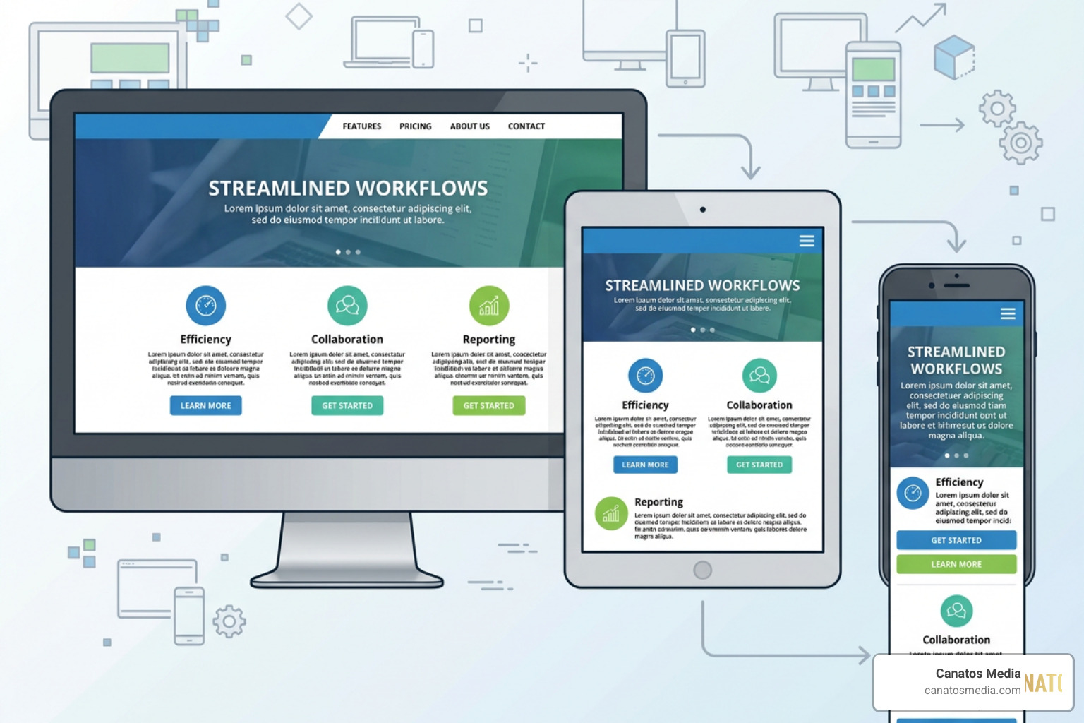
- Responsive Web Design: Your layout must use fluid grids and flexible images that scale dynamically based on the user’s screen width.
- The Viewport Meta Tag: This tiny line of HTML code tells browsers how to adjust the page’s dimensions and scaling to fit the device. Without it, mobile browsers will render your page at desktop width, forcing users to pinch and zoom.
- CSS and JavaScript Compression: We compress and minify style sheets and scripts to reduce the overall payload of your website.
- Image Optimization: Images should be served in modern formats like WebP or AVIF, and utilize the
srcsetattribute to deliver the correct image size based on the user’s screen resolution.
Optimizing Core Web Vitals and Page Speed
Speed is the ultimate conversion killer. If a mobile page takes longer than 2 seconds to load, 53% of users bounce instantly. To combat this, Google uses Core Web Vitals as direct ranking signals to measure user experience:
- Largest Contentful Paint (LCP): Measures loading performance. The main content of your mobile page should load in 2.5 seconds or less.
- Interaction to Next Paint (INP): Measures responsiveness. When a user taps a button or menu, the page must respond in under 200 milliseconds.
- Cumulative Layout Shift (CLS): Measures visual stability. Page elements shouldn’t jump around as images and fonts load. Your CLS score should be 0.1 or less.
At Canatos Media, we tackle speed issues by leveraging advanced caching, eliminating render-blocking resources, and utilizing lightweight content delivery networks (CDNs). Keeping your site fast keeps your bounce rate low and your engagement high.
Implementing Structured Data and AMP Alternatives
Years ago, Accelerated Mobile Pages (AMP) were highly recommended for mobile speed. However, in 2026, AMP is no longer a direct ranking factor or a necessity. Modern web design allows us to build lightning-fast pages directly on your primary domain without the limitations of AMP’s restricted framework.
Instead, we focus heavily on Structured Data (Schema Markup). By adding schema markup to your mobile pages, you help search engines understand the exact context of your content. This makes your site eligible for rich snippets in mobile search results, such as star ratings, product prices, FAQ accordions, and local business details. These visual enhancements dramatically increase your click-through rates (CTR) on small screens.
Strategic On-Page and Off-Page Optimization for Mobile Users
On-page mobile SEO is all about readability and thumb-friendliness. Because mobile screens are narrow, long blocks of text look like intimidating walls of words.
To keep users engaged, we structure mobile content using:
- Short paragraphs (no more than 2-3 sentences)
- Descriptive, bold subheadings (H2s and H3s)
- Bulleted lists and highlighted key takeaways
- Generous whitespace to prevent visual clutter
- Tap targets (buttons and links) that are at least 48×48 pixels with plenty of spacing around them to prevent accidental clicks

Off-page mobile SEO focuses on building authority. This involves earning high-quality backlinks from reputable local and industry-specific websites. When authoritative sites link back to yours, it signals to Google that your business is trustworthy, boosting your overall search visibility.
Optimizing for Voice Search and Conversational Queries
With 27% of users now relying on voice queries on their mobile devices, optimizing for natural language is essential. People don’t type the same way they speak. A desktop user might type “best digital marketing agency Long Island”, while a mobile voice searcher will ask Siri or Google Assistant, “Who is the best digital marketing agency near me in Long Island?”
To capture this high-intent traffic, we:
- Target conversational, long-tail keywords
- Structure content in a question-and-answer format
- Implement FAQ schema to feed direct answers to smart assistants
- Keep answers concise, clear, and easy to read aloud
Local Search Integration and Mobile SEO Service Strategies
Mobile search and local intent go hand-in-hand. In fact, 90% of local searches happen on mobile devices, and 46% of all Google searches have local intent. If you run a business in the tri-state area or Long Island, local mobile SEO is your golden ticket to attracting foot traffic and phone calls.
We optimize your local footprint by ensuring your Name, Address, and Phone number (NAP) are completely consistent across your website, social media, and local directories. We also optimize your Google Business Profile to ensure you appear in the coveted local Map Pack, making it incredibly easy for mobile users to tap “Call” or “Get Directions” while they are on the move. For an integrated approach that connects your local search visibility with high-impact creative content, explore how our team at Canatos Media can elevate your brand.
How to Measure Success and Scale Your Mobile Rankings
Measuring the success of your mobile SEO efforts requires looking beyond general traffic numbers. You need to analyze how mobile users specifically interact with your site compared to desktop users.
Using tools like Google Search Console and Google Analytics, we isolate mobile performance metrics to identify areas for growth. This data-driven approach allows us to make continuous, incremental improvements that compound into major ranking gains over time.
Essential Metrics Tracked by a Professional Mobile SEO Service
When we manage a mobile seo service campaign, we track several key performance indicators (KPIs) to ensure your business is getting a real return on investment:
- Mobile Click-Through Rate (CTR): Are your titles and meta descriptions compelling enough to win clicks on narrow mobile screens?
- Mobile Bounce Rate: Are users leaving your site immediately after landing on it? A high mobile bounce rate usually indicates slow loading speeds or poor mobile layout.
- Average Session Duration: How long are mobile users staying on your pages? Longer sessions signal high-quality, engaging content.
- Mobile Conversion Rate: Are mobile visitors taking action? Whether it’s filling out a short contact form, clicking a click-to-call button, or making a purchase, this is the ultimate measure of success.
Why E-commerce Sites Need Specialized Mobile Optimization
If you run an online store, mobile optimization is survive-or-die territory. Mobile commerce makes up the vast majority of online shopping traffic. If your product pages are slow to load, or if your checkout process requires filling out dozens of tiny form fields on a phone keyboard, shoppers will abandon their carts.
To prevent lost revenue, e-commerce sites need specialized mobile layouts, simplified checkout flows, and mobile-friendly payment options like Apple Pay or Google Pay. If you want to maximize your online store’s sales potential, check out our guide on Why Your Store Needs Ecommerce Website SEO to Survive, and make sure you Stop Overpaying for Your Ecommerce SEO Packages by choosing a partner that focuses on actual revenue growth.
Frequently Asked Questions About Mobile SEO
How long does it typically take to see results from mobile optimization?
While some technical fixes (like improving page speed or fixing broken responsive layouts) can yield immediate improvements in user engagement and bounce rates within a few weeks, significant ranking climbs usually take 3 to 6 months. SEO is a compounding process; as search engines crawl and re-index your optimized pages, your authority and visibility will steadily build.
What is the difference between responsive and mobile-friendly design?
A mobile-friendly website is essentially a desktop site that has been scaled down so it can be viewed on a mobile screen. While readable, it often requires users to zoom in to read text or tap tiny links. A responsive design is much more advanced — it dynamically rearranges, resizes, and reframes the entire layout of the website to fit the exact screen size of the device being used, providing a vastly superior user experience.
Can mobile SEO improvements boost my desktop rankings?
Yes, absolutely! Because Google uses mobile-first indexing, the mobile version of your website is the primary version used to determine rankings for both mobile and desktop search results. By cleaning up your mobile site’s speed, technical errors, and structured data, you will naturally improve your site’s overall authority and boost your desktop rankings as well.
Conclusion
In 2026, winning the search game means winning on mobile. A slow, clunky, or poorly formatted mobile website is a massive liability that actively drives potential customers straight into the arms of your competitors.
At Canatos Media, we don’t treat mobile SEO as an afterthought or a simple box to check. Our integrated strategy connects high-impact creative content, precise local targeting, and technical mobile optimization to drive measurable growth for businesses in the tri-state area and Long Island.
Ready to stop chasing the scroll and start dominating mobile search? Let’s build a website that loads fast, ranks high, and converts visitors into loyal customers. Explore our full suite of digital marketing, content creation, and technical optimization services today, and let’s grow your business together.